 THE GLOWNIQUE
How to Turn Your Business Logo into a Custom Neon Sign: The Complete Workshop Guide
Taking a 2D digital logo and turning it into a glowing physical sign is more than just tracing lines. Here is how tube bend physics, minimum stroke widths, gradient conversions, and backboard cuts actually work in the workshop—and how to get your design sign-ready without losing your brand identity.
Key takeaways
- Minimum letter scale: Maintain at least 3–4 inches of letter height for cursive script and 2–3 inches for capital letters to prevent light blobbing.
- Vector conversion: Thick block lettering uses double-stroke outline paths, while script fonts use single centerline tracing.
- Color fidelity: Lit LED flex radiates brighter than printed CMYK ink; adjust expectations for pastel tones or use hybrid UV printing.
- Hybrid UV-print fabrication: Logos with gradients, crests, or small subtext combine direct acrylic UV printing with neon overlays for perfect brand accuracy.
- Standoff mounting: Commercial signs should always use metal standoff barrels to create a clean shadow gap and allow proper heat dissipation.
Every week, business owners send us their vector brand files with the same simple request: 'Can you turn this into a neon sign exactly as it looks on my screen?' The honest answer from our fabrication bench is: almost, but with physics in between.
A digital logo lives in vector mathematics where lines can be hair-thin, gradients blend seamlessly, and negative spaces can shrink to fractions of a millimeter. A physical LED neon sign, by contrast, is built from flexible silicone tubing that has physical width (typically 6mm, 8mm, or 10mm), a minimum bend radius, and internal copper wiring.
Understanding how these physical constraints translate into sign design is the difference between a crisp, unmistakable brand statement on your reception wall and a muddy, illegible tangle of light. Here is exactly how we translate logos in the workshop, step by step.
1. The Physics of Minimum Stroke Width and Letter Height
The most fundamental rule of illuminated neon design is that light has physical volume. If your logo uses a tight, condensed serif typeface or delicate script flourishes, the glowing tube will bleed into adjacent strokes if they are placed too close together.
2. Single-Line Stroke vs. Outlined (Double-Stroke) Translation
When converting typography into neon, our design team chooses between two distinct approaches depending on your logo's font weight and overall scale:
| Style | Best Used For | Minimum Size | Visual Characteristic |
|---|---|---|---|
| Centerline (Single Stroke) | Thin script, cursive, compact logos | 24–36 inches total width | Clean, classic neon aesthetic; light runs down the center of each letter. |
| Outlined (Double Stroke) | Heavy bold, slab serif, chunky block fonts | 48+ inches total width | Traces the outer contour of thick letters, leaving the middle open. |
| UV Hybrid Overlay | Complex logos, gradients, fine taglines | 18+ inches total width | Crisp full-color UV print on acrylic with neon accents on key elements. |
The choice depends on whether your logo typography is hairline script or heavy bold block lettering.
3. How to Handle Brand Colors & Gradients
One of the most frequent surprises for brand managers is discovering that emitted light does not behave like printed CMYK ink. A pastel brand color like sage green or dusty rose looks beautiful in print because it absorbs ambient light, but when you illuminate silicone with internal LEDs, the light radiates outward and naturally appears brighter and more saturated.
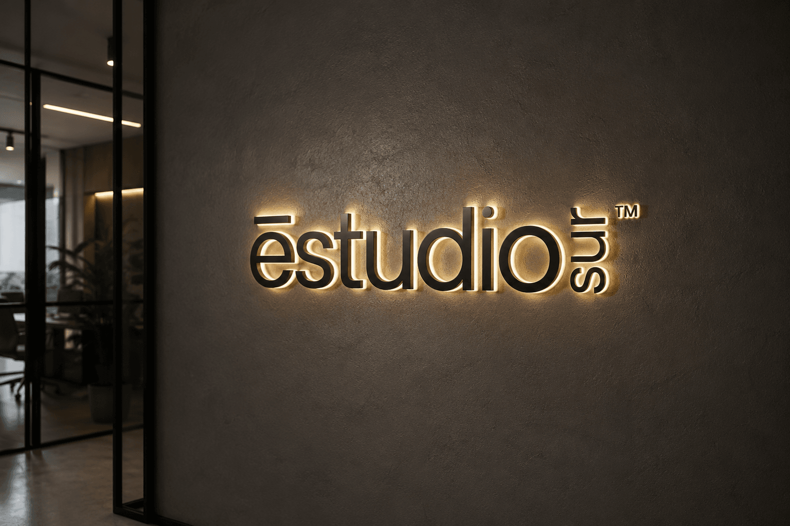
What about gradients and complex illustrations? Solid LED neon tubing cannot create a continuous soft gradient between two colors. When a logo contains a multicolor gradient or intricate secondary details (like registered trademark symbols or small location subtext), we use our UV Hybrid Fabrication method: the full-color graphic is high-resolution UV printed directly onto the acrylic backboard, and custom LED neon flex is overlaid onto the primary brand lines. This produces razor-sharp corporate fidelity with stunning 3D illumination.
A hybrid UV-print neon sign gives you the best of both worlds: 100% accurate Pantone color fidelity for complex crests, with vibrant glowing neon highlighting your main logo silhouette.
4. Selecting the Acrylic Backboard: Cut-to-Letter vs. Contoured vs. Solid Box
The backboard is the architectural foundation that holds your sign together. We offer three primary backboard formats for commercial logos:
- Cut to Shape (Contoured): The clear cast acrylic backing follows the perimeter of your logo with a 15–20mm offset. It creates an almost invisible footprint against textured feature walls (wood slat, brick, moss walls).
- Cut to Letter (Stand-Alone): The acrylic is hollowed out completely between words and letters. It yields the purest 'floating' look on reception walls, though it requires multiple discreet mounting points.
- Black / Mirrored / Frosted Acrylic Backing: Mounting onto high-gloss black or mirrored gold acrylic blocks out distracting background wall patterns and significantly boosts visual contrast in brightly lit corporate lobbies.
Next Steps & Related Reading
To explore all commercial options for your office or retail location, browse our custom logo neon signs collection, compare lighting styles in our front-lit vs halo-lit guide, and check out our custom business sign cost guide.
Frequently asked questions
- What file format do I need to submit my logo for a neon sign?
- Vector formats like Adobe Illustrator (.ai), Encapsulated PostScript (.eps), SVG, or high-resolution PDF work best. If you only have a raster image (PNG or JPG), ensure it is at least 300 DPI so our drafting team can vectorize your curves without loss of detail.
- What happens if my logo has very small tagline text?
- Because silicone LED flex has a minimum bend radius and a fixed width (6mm–8mm), tiny subtext lines under 1.5 inches tall cannot be physically bent into readable neon. For these elements, we use precision UV printing directly on the acrylic backboard while illuminating the primary logo mark with neon.
- Can you match exact Pantone brand colors in neon?
- Yes. We stock over 18 core illuminated LED flex colors and can formulate custom acrylic tints or utilize direct UV printing to match specific Pantone spot colors and brand identity standards precisely.
- What material is used for the backboard of a custom logo sign?
- Most indoor commercial logo signs are fabricated from 5mm premium cast PMMA acrylic (shatter-resistant and optically clear), precision-cut using industrial CNC laser routers with flame-polished edges.
- How long does it take to produce and deliver a custom logo sign?
- Custom business logo neon signs typically require 3 to 5 business days for design drafting and handcrafted assembly in our workshop, followed by 3 to 6 business days for express insured courier delivery.
Sources
- Graphic Design & Vector Preparation for CNC/Laser Sign Fabrication — International Sign Association (ISA) Technical Fabrication Standards (accessed 24 August 2026)
- Color Rendering and Transmittance in Illuminated PMMA Acrylic — Society of Plastics Engineers (SPE) Technical Bulletin on Optical Polymers (accessed 24 August 2026)
Turn the idea into a sign
Send us your logo, words or a rough sketch and we'll come back with a free digital mockup and a quote for your exact size — before anything is built.