 THE GLOWNIQUE
How to Choose the Right Neon Color for Your Sign: A Practical Checklist
Choosing a neon color isn't just about personal taste—ambient light, background contrast, and viewing distance change how glowing colors read in real life. Here is our workshop checklist for picking the right hue for your storefront, wedding, or interior wall.
Key takeaways
- Ambient light is king: High-contrast saturated hues (white, blue, red) hold up in bright daylight, while softer amber and blush pink thrive in evening settings.
- Contrast beats saturation: Neon yellow or lime green can vanish against light walls; dark backdrops amplify glow dramatically.
- Use-case color psychology: Hot pink projects energetic hospitality; electric blue signals corporate trust; warm amber creates cozy boutique intimacy.
- LED silicone vs glass: Flexible silicone neon flex delivers uniform, dot-free lighting across 13+ consistent Pantone-matched colors without high heat.
- Always test in context: A 2-hour free digital mockup under realistic ambient lighting prevents expensive installation color regrets.
Many customers choose a neon color the same way they choose a paint swatch: whatever looks good in the moment. Then the sign goes up, and the color reads completely differently against the wall, in the actual lighting of the room, or from the distance most people will view it from. By then, the decision is made and the money is spent.
At The Glownique, we've worked with many customers through this exact decision, from couples ordering their first wedding sign to business owners outfitting a storefront. Choosing a color without testing it in context is one of the most common missteps we see, and it's also the easiest to avoid. Color choice affects readability, mood, brand perception, and how well a sign performs across different lighting environments. It deserves more than a gut feeling.
This article gives you a practical framework for making that decision. By the end, you'll know what different glowing hues actually communicate, how ambient light changes everything, and what questions to answer before you commit to a neon color.
What "neon color" actually means and why it matters for signage
The term neon color gets used loosely in two very different contexts, and the confusion between them causes real problems for sign buyers. In everyday design language, neon colors are extremely high-saturation, high-brightness hues that appear to glow: hot pink, electric blue, lime green, vivid orange. The name refers to the visual effect, not the gas neon itself. These colors differ from traditional pigment colors because standard pigments primarily reflect light, which is why they look flatter and less intense at the same saturation level.
The distinction between neon and fluorescent colors is mostly one of convention rather than science. Fluorescent colors describe the broader technical category: hues that absorb UV or high-energy light and re-emit it at a different wavelength. Neon is the design shorthand for any especially vivid, luminous-looking color. In practice, the two terms are used interchangeably.
In signage, the word "neon" means something more specific: it refers to the actual light output of a sign, not a color value on a screen. Many colors marketed as neon in design or print simply mimic the glow of real signage through intense saturation. The true luminous effect only comes from a light-emitting source. This matters because a color that looks striking on screen may not translate the same way in a physical sign, especially under different ambient lighting conditions. A good digital mockup bridges that gap, but only if it's built to show the sign in realistic conditions at an accurate viewing distance and under ambient light that approximates the real space.
How different neon hues affect mood and the people who see them
Color doesn't just look a certain way; it triggers a specific emotional and behavioral response. Hot pink, roughly represented by neon HEX code #FF10F0 in digital form, reads as energetic, playful, and bold. It works well for bars, beauty studios, wedding backdrops, and any brand that wants to project confidence and a sense of fun. It also photographs exceptionally well in low ambient light, which makes it one of the most popular choices for hospitality spaces and events where social sharing drives value.
Electric blue, in the #1F51FF range, signals something different: technology, calm authority, and modernity. It's a strong choice for corporate lobbies, fitness studios, and storefronts in competitive retail environments where credibility matters as much as visibility. Unlike hot pink, blue tends to settle a space rather than energize it, which can encourage longer dwell time in lounges and retail environments built around browsing.
Lime green (#39FF14) is the most visually aggressive of the common luminous hues. It grabs attention from a distance, which makes it effective for outdoor signage and high-energy retail, but harder to deploy in intimate interior spaces without overwhelming the room. Warm amber and softer orange tones sit at the opposite end of the spectrum: they produce an inviting, vintage-adjacent glow that suits cafés, boutiques, and residential installations where atmosphere matters more than raw visibility. Cooler, brighter hues maximize impact; warmer, softer hues prioritize approachability.
Quick neon color mood reference
Hot pink: bold and playful. Electric blue: modern and trustworthy. Lime green: high-energy and attention-grabbing. Warm amber: inviting and atmospheric. Use this as a starting filter before moving to context and environment.
Popular neon color palettes and the contexts where they work
A shared digital reference makes these comparisons more concrete. The four most commonly used sign color families form a practical neon color palette for mockup work: hot pink (#FF10F0), electric blue (#1F51FF), neon green (#39FF14), and warm amber (#FF5F1F). These neon HEX codes are digital approximations, not exact fabrication specifications. The actual output of a physical sign depends on the tube type, coating, and production method. Think of these values as a starting vocabulary, not a final answer.
For storefronts, high-contrast colors maximize legibility from a distance. High-saturation hues such as white, pink, and blue generally hold contrast well against most exterior facades. If your storefront faces direct sunlight, prioritize red, green, or white; bright sunlight washes out lighter, lower-saturation hues more aggressively than darker ones. For outdoor visibility, the contrast between the sign and its background matters more than any specific neon color.
For weddings, soft warm white, blush pink, and warm amber remain the most reliable choices for ceremony backdrops and reception areas. They photograph naturally in low ambient light and complement most floral palettes without competing for attention. For events and activations where the environment is more controlled, bolder palettes hold their visual intensity better across varying light levels: lime green, electric blue, and hot pink all perform well in mixed-light event spaces.
For home and interior décor, restraint is the guiding principle. A single neon accent in a neutral space carries far more visual weight than multiple colors competing for attention. Choose one dominant hue that responds to the existing room palette, and let the sign be the focal point rather than one element in a busy composition.
LED silicone neon vs glass neon: how the technology changes your color options
Traditional glass neon produces color through gas discharge. Pure neon gas gives a red-orange glow; other gases and phosphor coatings create additional colors. The result is a narrow, fixed color range that is difficult to adjust once the tube is made. The color also depends heavily on the glass coating and the specific gas fill, which means achieving a precise hue match in glass neon requires significant fabrication expertise and still involves inherent variation.
LED silicone neon, the technology used in all signs made at The Glownique, works differently. Flexible silicone tubing over LED strips produces a smooth, dot-free line of light with consistent brightness across the full length of the sign. The color range is significantly broader than glass neon, color matching is more precise, and the output remains consistent over time. For most commercial and decorative applications, LED silicone neon delivers a cleaner, more uniform glow with greater color accuracy.
How ambient light affects your neon color choice
Ambient light is the variable most buyers underestimate. A sign that looks vivid in a dim studio may appear washed out in a bright retail environment flooded with daylight. For outdoor or high-ambient-light settings, white and high-contrast saturated hues such as red and green consistently hold up in direct sunlight; lighter or lower-saturation options like lime green and yellow tend to wash out more quickly. For intimate indoor spaces, warmer and softer hues read more intentionally. On the technology side, low-voltage LED systems run cooler than gas-filled glass tubes, which means brightness stays consistent over the life of the sign. Glass neon runs hotter, and that heat can cause slight color variation as the tube ages.
A practical checklist for choosing your neon sign color
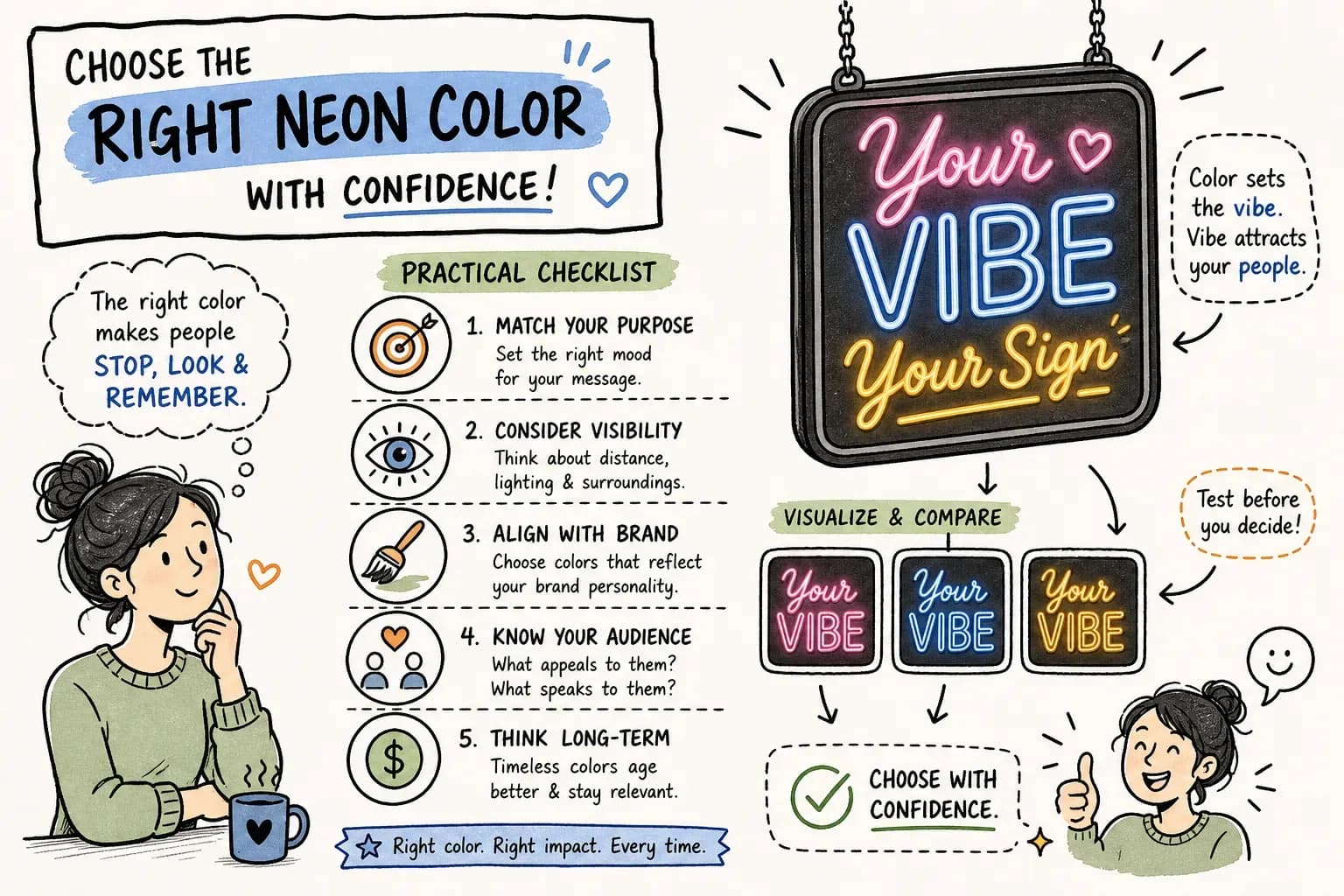
Work through these questions in order. Each answer eliminates options and narrows the field before you commit to a neon color. By the time you reach the last question, most of the guesswork is gone.
- Where is the sign going? Indoors in a dim space, a bright retail interior, or outdoors in variable daylight conditions each require a different approach to color selection.
- What is the primary purpose? Brand visibility from a distance, atmosphere in a specific setting, a photography backdrop, or a directional element all favor different hues.
- Who is the audience, and what emotional response do you want? Use the color psychology framework above: playful and energetic, calm and trustworthy, fresh and youthful.
- What colors already exist in the surrounding environment? Your chosen hue should complement the exterior facade, interior palette, or event décor, not compete with it.
- How far away will most viewers be when they first see the sign? Distance changes legibility requirements significantly. High-contrast pairings matter more at a distance than at close range.
Legibility deserves specific attention. High saturation does not automatically mean high legibility. Neon yellow on a light wall can disappear at a distance despite looking vivid on screen. Dark backgrounds amplify neon glow dramatically; if the sign will sit against a light wall, warm white or cooler blue will hold contrast better than lime green or yellow. For text-heavy signs, stick to one dominant color. Multi-color signs work best for logos, icons, or decorative shapes where legibility is secondary to visual impact.
One more point worth stating clearly: the contrast between the sign and its background matters more than the color itself. The most legible outdoor sign combinations consistently involve high-contrast pairings, such as white on dark blue, yellow on black, or red on white. A muted color in a high-contrast setting will outperform a vivid color in a low-contrast one every time.
How to see your neon color choice before production starts
A quality digital mockup is the most important tool in this decision. It renders the sign in its actual intended environment, not against a plain white background. It shows the glow effect, the acrylic backing color, and the approximate scale of the sign in context. A mockup previewed in a dark-room render will look different from the same sign in a bright retail environment, so ask to see the rendering in conditions that approximate the real space.
Viewing distance matters in mockup review too. Close-up renders flatter the sign. A realistic distance shows you how legible and impactful the color choice actually is from the perspective of someone walking past, not someone examining it up close. If a color doesn't hold up at that distance in the mockup, it won't hold up in the real environment either.
At The Glownique, every order starts with a free digital mockup before any payment or production begins. The mockup shows the exact size, color, and glow of the sign in context, removing the guesswork from neon color selection entirely. The LED silicone neon color library covers the full range of common electric colors, and the design team iterates until the color is right. Every sign ships worldwide with full tracking and is backed by a 5-year warranty, so the color you approve in the mockup is the color that arrives at your door, built to stay that way.
Making the final call
Neon color choice is a function of use case, environment, audience, and technology. Personal preference is a starting point, not a decision framework. The three variables that matter most are ambient light, background contrast, and whether LED silicone neon or glass neon better suits the application. Get those three right and most other decisions follow naturally.
The checklist in this article gives you a clear starting point. A free digital mockup from The Glownique's design team gives you certainty. Use both before committing to a color, and reach out to get your mockup started, it's the most reliable way to make sure the sign you imagine is the sign you receive.
Frequently asked questions
- Which neon colors are most visible in direct sunlight?
- White, vivid red, and saturated electric blue hold contrast best in direct sunlight. Lighter hues like neon yellow or lime green tend to wash out faster against bright exterior walls.
- What is the best neon color for wedding photos?
- Warm white (2700K–3000K), soft blush pink, and warm amber photograph most naturally without blowing out the camera sensor or clashing with floral arrangements.
- Why does a neon color look different on a wall than on a computer screen?
- Screens emit RGB light from pixels, whereas physical signs emit light that reflects off surrounding paint, decor, and architectural surfaces. Wall color and ambient lighting shift how the glow is perceived.
- Can I dim my neon sign if the color is too intense at night?
- Yes. All The Glownique LED neon signs can be paired with a wireless RF remote that controls brightness from 1% to 100%, allowing you to adjust the mood effortlessly.
- How accurate is the color in a digital mockup compared to the finished sign?
- Our mockups simulate actual optical-grade silicone tubing and acrylic backboards under real room lighting, giving an accurate preview before handcrafted production starts.
Sources
- Perceivable Color Contrast and Legibility Standards — W3C Web Accessibility Guidelines (WCAG) (accessed 28 August 2026)
- Human Eye Color Sensitivity and Wavelength Perception in Luminous Displays — Illuminating Engineering Society (IES) (accessed 28 August 2026)
Turn the idea into a sign
Send us your logo, words or a rough sketch and we'll come back with a free digital mockup and a quote for your exact size — before anything is built.