 THE GLOWNIQUE
Front-lit, halo-lit and dual-lit at a glance
| Feature | Front-lit | Halo-lit (reverse-lit) | Dual-lit |
|---|---|---|---|
| Where the light goes | Forward, through a translucent acrylic face | Backward, out of the letter's back onto the wall | Both: through the face and onto the wall |
| Letter face | Translucent, carries the colour | Solid metal — the letter reads as a silhouette | Translucent face on a letter that also throws a halo |
| What you read after dark | The glowing letters themselves | The dark letter shapes against a ring of light | Glowing letters with depth behind them |
| Reading from a distance | The strongest of the three | Weaker; best where viewers are close | Strong, from the lit face |
| What the wall needs | Nothing — the wall plays no part | A light, matte, fairly smooth surface | Helps, but the face still reads on any wall |
| Mounting | Flush, raceway or backer panel | Standoffs, so light can reach the wall | Standoffs |
| Build complexity | Usually the simplest of the three | Adds standoffs and depends on the wall | The most involved: two lighting runs |
| Typical setting | Storefronts and façades read from the street | Receptions, lobbies, boutiques, interiors | Flagship frontages and feature walls |
What is a front-lit channel letter?
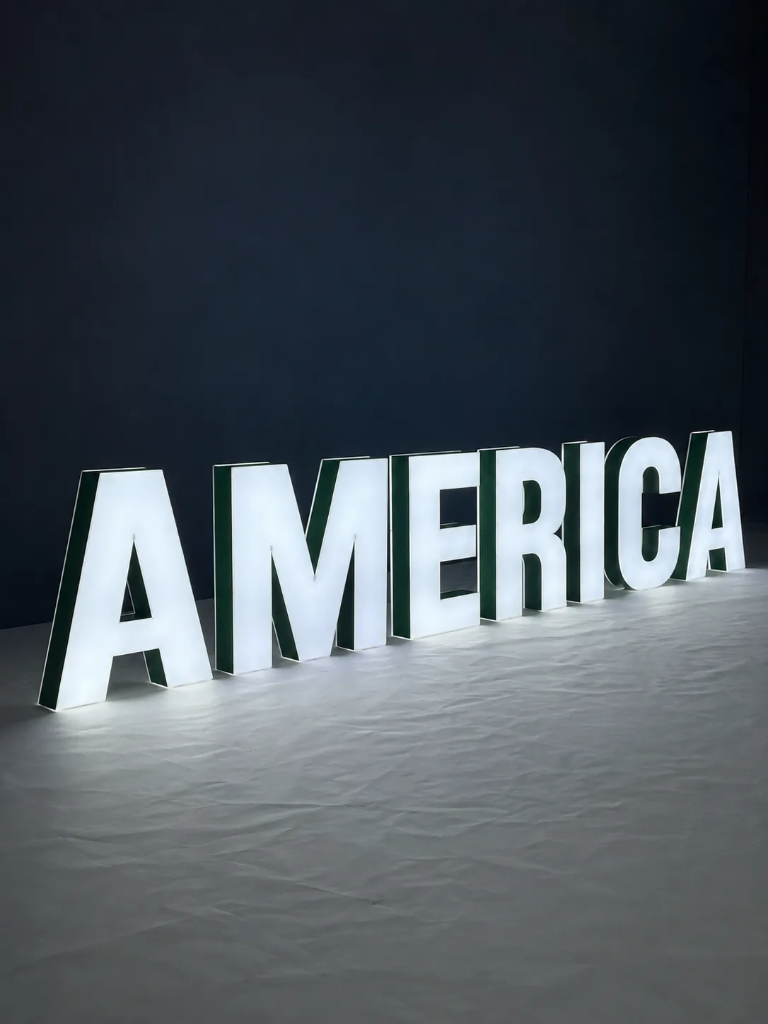
A front-lit (face-lit) channel letter is a hollow letter with metal sides — the “returns” — and a translucent acrylic face. LED modules inside light the face from behind, so the letter itself glows toward the street.[5] Sign makers often call it the standard channel letter.
Because the light comes straight at the viewer, front-lit letters are the most legible of the three at a distance and in daylight, and the face can carry your brand colour. The wall behind them plays no part, so they work on brick, render, cladding or glass. Choose front-lit for a shopfront read from across the street or from passing traffic.

What is a halo-lit (reverse-lit) channel letter?
A halo-lit letter has a solid face — usually metal — and a clear or open back. The LEDs inside shine backwards, onto the wall, and the letter is mounted on standoffs so the light has room to spread. What you see after dark is the letter's dark shape outlined by a ring of light.[5][3]
Distance from the wall matters. One fabricated-metal letter maker uses about 1.5 inches as its default standoff; too far and the halo blurs, too close and the light has nowhere to go.[6][3] The wall matters just as much: a halo is reflected light, so a dark, glossy or heavily textured surface — or a steep viewing angle — weakens it and the letters lose definition.[3] Our wall surfaces and standoffs guide covers how plaster, wood, brick and tile each change the effect.
Halo-lit reads as considered rather than loud, which is why it is the usual choice for reception walls, lobbies and boutiques where people see the sign from a few metres away. See our backlit and halo-lit signs for finishes and examples.
Is backlit the same as halo-lit?
For channel letters, usually yes. Letter manufacturers and trade magazines use halo-lit, reverse-lit and back-lit for the same thing: a letter that throws its light onto the wall behind it.[5][3]For lightboxes and posters, “backlit” means something else — light passing through a translucent graphic from behind. The US Sign Council avoids the ambiguity altogether with “internal”, “external” and “exposed” illumination.[2]
On this site, halo-lit always means letters that glow onto the wall, and a backlit lightbox means a panel lit through its face. If a quote from anyone just says “backlit”, ask which one is meant.
What is a dual-lit channel letter?
A dual-lit letter — also called combination-lit — has a lit face and a halo: the face reads from a distance, and the glow on the wall adds depth.[5] A baffle inside the channel can separate the two light paths, so the face and the halo can run different colours.
Dual-lit is also the practical answer when you want a halo on a wall that will not hold one well — dark cladding, glossy tile or rough stone — because the face stays legible whatever the wall does.[3] It is the most involved of the three to build, with two lighting runs in every letter.
Which lighting style should you choose?
The sign is read from the street or from passing cars
Front-lit, or dual-lit if you also want depth.
The sign is on a reception wall, in a lobby or a boutique
Halo-lit — people are close, and the silhouette reads as premium.
The wall is dark, glossy or rough
Front-lit or dual-lit, or add a lighter backer panel behind halo letters.
The face must carry a strong brand colour
Front-lit or dual-lit; a halo-lit face is solid metal.
You are in a shopping centre or a leased unit
Read the landlord's sign criteria first: some require raceway mounting in a colour that matches the fascia.
How big should channel letters be?
The US Sign Council measures legibility as a Legibility Index: feet of viewing distance per inch of capital-letter height. Its average is 30 — so 1-inch letters read at about 30 feet and 10-inch letters at about 300 feet — and text set in all capitals needs letters about 15% taller.[1][2]
| Capital-letter height | Readable to about (sign facing the viewer) |
|---|---|
| 6 in | 180 ft |
| 8 in | 240 ft |
| 12 in | 360 ft |
| 18 in | 540 ft |
| 24 in | 720 ft |
Distances are the Legibility Index of 30 multiplied by letter height; typeface, contrast and lighting move the real figure either way.[1]
A wall sign that runs parallel to the road — the usual shopfront fascia — needs roughly three timesthe letter height, because drivers see it at a steep angle. The Council's rule of thumb for those signs is: letter height in inches = (number of traffic lanes × 10 + the setback from the curb in feet) ÷ 5. Two lanes and a 20-foot setback gives 8-inch letters. In the Council's field study, drivers missed 30% of parallel signs even when they were two to three times larger.[2]
We could not trace the popular “one inch per ten feet” charts to primary research; the Council's own figure for signs facing traffic is thirty.
How are channel letters mounted?
- Flush (direct) mount
- Each letter is fixed to the wall on studs, with its own wiring pass-through. The cleanest look; the most holes in the wall.
- Raceway
- The letters sit on one slim box that carries the wiring, so the wall needs far fewer penetrations and the sign is easier to service. Some landlords require it.
- Backer panel
- The letters are mounted on a panel that doubles as the wiring enclosure — useful where the wall itself cannot be drilled much, or needs a contrasting background.
- Standoffs
- Used for halo-lit and dual-lit letters, holding each letter off the wall so its light can reach the surface behind it.
Mounting methods as described in sign trade and manufacturer guidance.[4][7][8]
Permits, listing and your installer
In the US, the National Electrical Code requires electric signs to be listed, whatever their voltage; the product standard behind that listing is UL 48, and the listing mark is applied at the factory rather than in the field.[10][9][11] On top of that, many cities require a sign permit, most landlords must approve an exterior sign, and a hard-wired illuminated sign is normally connected by a licensed electrician.
The Glownique makes and ships channel letters; it does not install them. Before you order, ask your installer what your city will inspect for, and tell us where the sign is going so the quote covers the right build. Your mockup shows the sign's dimensions, which a permit application will ask for.
Channel letter lighting: common questions
Which channel letter lighting is most visible from the road?
Front-lit. The whole face of each letter glows, so the letters themselves stay legible from further away and through a windscreen. Dual-lit reads just as well from a distance, because it also has a lit face. Halo-lit letters are read as dark shapes against a ring of light, which works best when viewers are close.
Is backlit the same as halo-lit?
For channel letters, usually yes: sign makers use halo-lit, reverse-lit and back-lit for letters that throw their light onto the wall behind them. For lightboxes and posters, though, backlit means light passing through a translucent graphic from behind. When a quote says backlit, check which of the two is meant.
Do halo-lit letters work on dark or textured walls?
Less well. A halo is light reflected off the wall, so a dark, glossy or rough surface — or a steep viewing angle — weakens it and the letters lose definition. Sign trade guidance suggests a light, matte background, a contrasting backer panel, or dual-lit letters when the wall cannot be changed.
How far from the wall should halo-lit letters sit?
Close, but not flush. One metal-letter maker's default standoff is about 1.5 inches. Too far and the halo blurs; too close and the light has no room to spread. The right distance depends on the letter's depth and the wall, so it is set for the design rather than guessed.
Can the face and the halo be different colours?
Yes, on dual-lit letters. A baffle inside the channel separates the two light paths, so a white face can sit over a coloured halo, or a brand-colour face over a warm-white glow.
How big should channel letters be?
The US Sign Council's average rule is one inch of capital-letter height for every 30 feet of viewing distance, so 10-inch letters read at about 300 feet. Letters on a wall parallel to the road need to be roughly three times larger, because drivers see them at a steep angle.
See your logo in all three before you decide
Send your logo and a photo of the wall, and the free mockup shows it front-lit, halo-lit or dual-lit at your chosen size.
Planning a budget? What drives the cost of a business sign. Choosing for a specific site? Storefronts, restaurants and offices and receptions.
Sources
- Sign Legibility Rules of Thumb — United States Sign Council (2006). Accessed 24 September 2026.
- Best Practice Standards for On-Premise Signs — USSC Foundation (2018). Accessed 24 September 2026.
- Hello Halo: A Deeper Look at Halo-Lit Channel Letters — GRAPHICS PRO (2019). Accessed 24 September 2026.
- Behind the Letter: Raceways' Roles in Channel Letter Projects — GRAPHICS PRO (2020). Accessed 24 September 2026.
- What are Channel Letters? — Gemini Product Guide. Accessed 24 September 2026.
- Lit Fabricated Metal Halo Lit: Specifications, Mounting, and Installation — Gemini Product Guide. Accessed 24 September 2026.
- Mounting Hardware: The Foundation Behind Every Sign — Gemini Product Guide. Accessed 24 September 2026.
- Exhibit B: General Sign Criteria for Shopping Center — Vestar (example landlord sign criteria). Accessed 24 September 2026.
- UL 48 Standard for Electric Signs — International Sign Association. Accessed 24 September 2026.
- Guidelines for Application of NEC Changes in Electric Sign Requirements — International Sign Association. Accessed 24 September 2026.
- Listed Signs: Identifying UL Certification and Proper Use — UL. Accessed 24 September 2026.